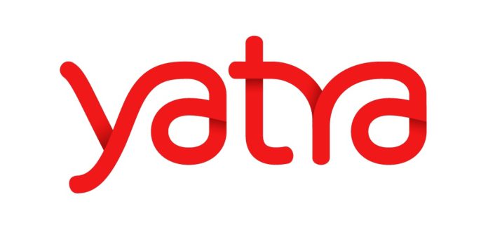
Yatra, one of India’s leading online travel portals has revealed its new brand identity and logo. Yatra has always stayed in step with the needs of all types of travellers, evolving with the changing needs and behaviour of consumers. Today, travellers are looking for more out of travel and are ready to explore new and diverse experiences. The new identity captures the fluidity and smoothness of travel experiences that today’s Indian traveller seeks.
The new brand identity is contemporary and evolved, and showcases the richness of the product and services Yatra offers. The marketplace model allows verified sellers to list their travel products on Yatra’s site thus enlarging the bouquet of travel products available for travellers. The change comes at a time of continued growth for the company which started out a decade ago, and signifies Yatra’s evolution as it continues to connect with the new age traveller.
Commenting on the occasion Sharat Dhall, COO (B2C), Yatra said, “Today we are much more than a booking site for flights, hotels and packages. We are a travel marketplace. And our new logo symbolises just that. The change in brand identity is coupled with the evolution of Yatra’s product offering, covering an unmatched range across flights, hotels, holidays, bus, train, cabs, homestays, activities and cruises. Today we have everything that a traveller needs on our site, and truly the one-stop travel platform for Indians. We are bursting with new ideas, with new discoveries to be made, and newer journeys to be experienced.”
The new brand colour is red and stands for exuberance. It is also a symbol of physical movement which goes very well with the overall concept of a journey. While the colour stands for vibrancy, the font is friendly and approachable – Yatra’s personality traits. Together, it lends itself to a fresh, energetic, young and aspirational look.
Vikrant Mudaliar, Chief Marketing Officer, Yatra said, “The change in brand identity is not only about the change in logo and colour but also a change in what the brand stands for along with the branding elements such as tonality, communication, look and feel. The new red logo showcases the richness of our experience and the expansive depth of our product portfolio. It also helps us to stand out in an increasingly cluttered media environment and at the same time lends a sense of confidence and reliability to our brand. The changed Yatra logo is fluid, just like travel should be. The new logo type face is hand drawn and inspired from the trail of a journey. The logo is free flowing and not bound, just like our plans should be. The logo stands for a seamless travel experience that Yatra provides with the new marketplace model.”
Apart from the logo change, the branding elements, communication and messaging have been given a more contemporary look.


